thankQ Help
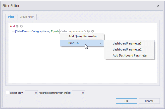
To filter data in the Query Builder, click the Filter... button. This will invoke the Filter Editor dialog, which allows you to build filter criteria
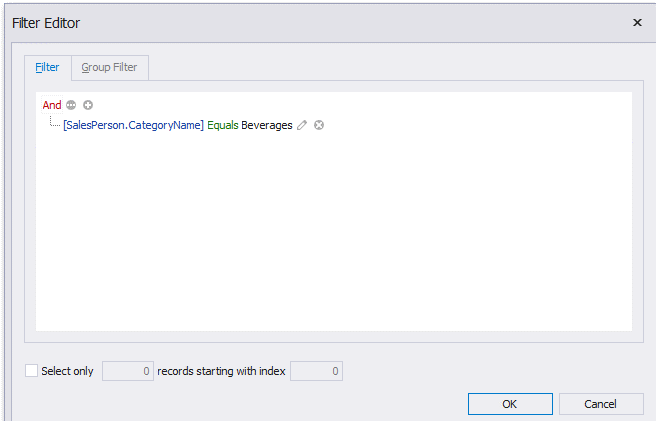
In the Filter Editor, you can compare a field value with the following objects.
•A static value (represented by the  icon). Click this button to switch to the next item mode ("another field value") to compare the field value with another field value.
•Another field value (represented by the  icon). Click this button to switch to the next item mode (“parameter value”) to compare the field value with a parameter value.
•A parameter value (represented by the  icon). Click this button to switch back to the initial mode ("static value") to compare the field value with a static value.
Thus, you can pass the query parameter to the filter string. To do this, click the button, then click the button and finally click <select a parameter>.
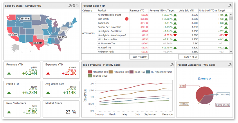
The dashboard visualises data using different types of elements (dashboard items) - charts, grids and pivot tables, maps, etc. - and allows users to interact with these elements. For example, users can filter a dashboard using the Master Filtering feature, perform a drill-down to change the detail level of data, use dynamic parameters, etc.
Data visualisation items represent UI elements used to display data within the dashboard.
Dashboard Item |
Image |
Description |
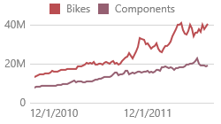
Chart |
|
Displays data graphically using bars, lines, points, etc. The following documentation is available. |
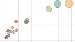
Scatter Chart |
|
You can use the Scatter Charts to visualise relationships between numeric variables. The following documentation is available. |
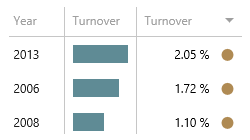
Grid |
|
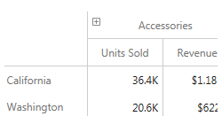
Allows you to present data in tabular form. The following documentation is available. |
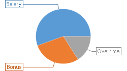
Pies |
|
Displays a series of pies or donuts that represent the contribution of each value to the total. The following documentation is available. |
Cards |
|
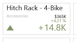
Displays a series of cards, each illustrating the difference between two values. The following documentation is available. |
Gauges |
|
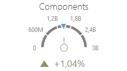
Visualises data within a series of gauges. The following documentation is available. •WinForms Designer - Creating Gauges
|
Pivot |
|
Displays cross-tabular reports and allows you to analyze multi-dimensional data. The following documentation is available. •WinForms Designer - Creating a Pivot
|
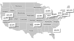
Choropleth Map |
|
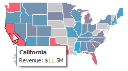
Allows you to colourise required areas in proportion to the provided values. The following documentation is available. |
Geo Point Map |
|
Allows you to place callouts on the map using geographical coordinates. The following documentation is available. |
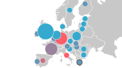
Bubble Map |
|
Displays bubbles on the map using geographical coordinates. The following documentation is available. |
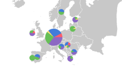
Pie Map |
|
Allows you to place pies on the map using geographical coordinates. The following documentation is available. |
Range Filter |
|
Allows end-users to apply filtering by dragging selection thumbs along the argument axis. The following documentation is available. |
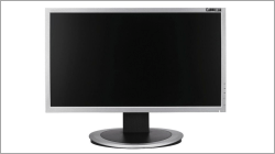
Images |
|
Allows you to add static images or use images from a data store. The following documentation is available. |
Text Box |
|
Use the Text Box dashboard item to display rich text within a dashboard. The following documentation is available. |
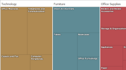
Treemap |
|
Use the Treemap dashboard item to visualise data in nested rectangles. The following documentation is available. |